Okay, so I’ve recently been doing a bit of conversion, generating ebooks. I’ve had a number of people ask about the process, so I figured I may as well write a blog post about it. (Yay for content generation, right?) Anyway, I’m far from a master at this but I have worked out the kinks in getting a manuscript out of Microsoft Word and into the Shakespearean tragedy that is Amazon. How something can be simultaneously wonderful and painful, I’m still working to understand.
Anyway, you will need the following things before proceeding:
A completed manuscript. (This may seem glaringly obvious, but I suppose in a country where coffee needs to be labeled hot, nothing is too obvious to mention.) Your manuscript should be (at this point) finished, edited, proof-read, left to age gracefully in a wooden ice box on the side of the Rocky Mountains for a couple months, then re-read until you don’t want to change even one comma.
Okay, perhaps that’s a lie. No true author can ever read their own work and not want to change something. So, suffice to say, get the edits and proofs done, and put the manuscript in a state where you can read it without screaming.
Completed artwork. This includes the cover as well as any interior (chapter header) art you wish to include as well as if you are going to use an artistic element as a scene break. (Looks a bit nicer than * * * in print.) This too is part of the whole completed manuscript thing. You’ll want to have the interior art embedded in the Word document beforehand.
Calibre Ebook Management. Here I am again with the glaringly obvious thing. It’s difficult to use a piece of software without actually having that software installed. So. Install it. If you’ve never heard of it, you can find it here: GET CALIBRE. I do not have any affiliation with the creator of Calibre, other than using the software.
Microsoft Word – This little guide is written assuming you are using MS Word. I’m not terribly familiar with OpenOffice, but if it has the ability to save a document as Webpage, filtered, it should be okay.
Step One – Formatting in MS Word
There are a few things to bear in mind when formatting the manuscript to be turned into an e-book. I tend to have three copies of the MS. One is a master file with no formatting at all, the same thing the editors and proofreaders saw. Take that file and save two other copies with different names, one for e-book conversion and one for paperback conversion if you’re going to do that.
With an e-book document, most of the fancy fonts aren’t going to make it into the final MOBI file. That nice fancy Foglighten font you’ve got as chapter titles is going to turn into something plain. Kindle readers (so I have been told) are more interested in story than fancy, so don’t worry too much if your nice fonts go poof.
Drop Caps – It’s been my experience that drop caps and Calibre don’t get along well. They float above the line, disappear, migrate to another page, and so on. Even the e-books my publisher puts out sometimes have drop caps with an irresistible migratory urge to head south. (I guess it’s the margaritas?) So, unless you’re a master already at converting e-books (in which case, I doubt you’re bothering to read this) skip the drop caps for the Kindle version. In print, they’re fine.
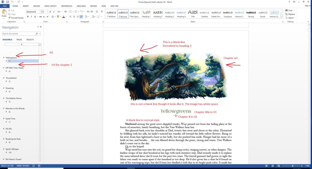
Page Breaks – herein comes the tricky part. I found a little workaround that helps, since I like to use chapter header art. This is a screenshot of The Forest Beyond the Earth Word document that I set up for ebooks. By default, Calibre detects new chapters with Heading 1 or Heading 2 styles. The problem I ran into when using chapter art, is that the heading comes after the artwork. That resulted in the image floating by itself on a separate page.
To get around this, I added a blank line formatted with Heading 3 above the image. I’ll explain more about how that helped later on, but for now… if you are using chapter header art and you don’t want it floating on a separate page, drop a blank heading 3 line above it.
Once you have the Word document ready and formatted, the next thing you’ll want to do is save it. After you save it, save it again just to be sure. When you’re sure the e-book formatted document is saved, go back into the file menu and select “Save as.” Scroll down the document type to “Web page, filtered.”
I suggest you save this file in a separate directory as Word will create a subfolder for all the images contained in the document. You will wind up with an HTML file and a folder.
After the save completes (be careful not to close Word before it’s done exporting) you’re ready for Calibre.
Calibre Ebook Management
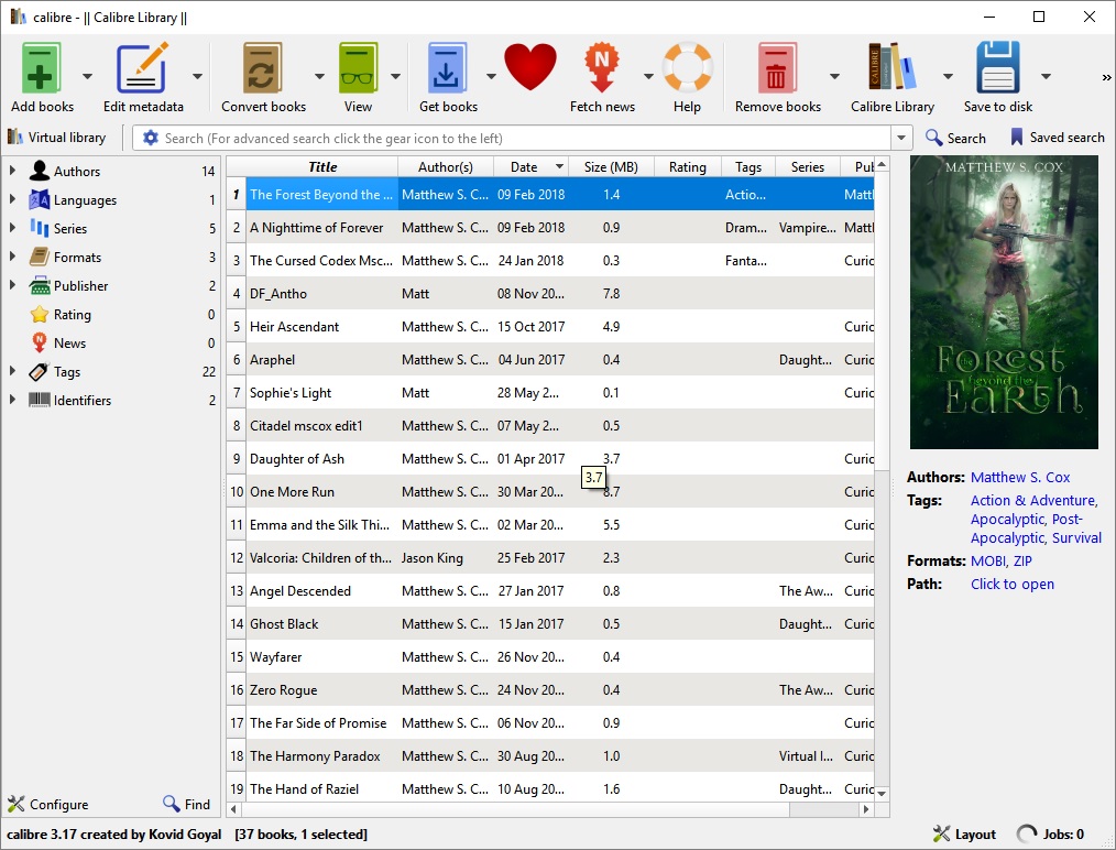
This is the main screen you’ll get when you open Calibre. Any e-books you have are in the middle, the highlighted one will display its cover in the top right.
The first step – click the “add books” button at the top left corner, and navigate it to the filtered webpage document you just made.
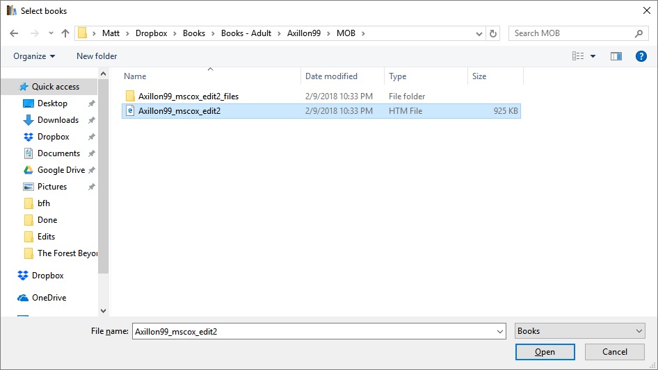
Here, I’m using Axillon99 as an example. This is what the folder should look like where Word did the export. The highlighted file is the HTM, the folder above that contains the artwork. Click on the HTM file and hit “Open.”
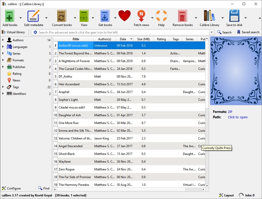
Calibre will then import the webpage document and appear like this. Since you haven’t done anything yet (and Calibre is not psychic) the cover area shows a fancy little pattern like grandmother’s tea set.
Next step: click on the “convert books” button at the top.
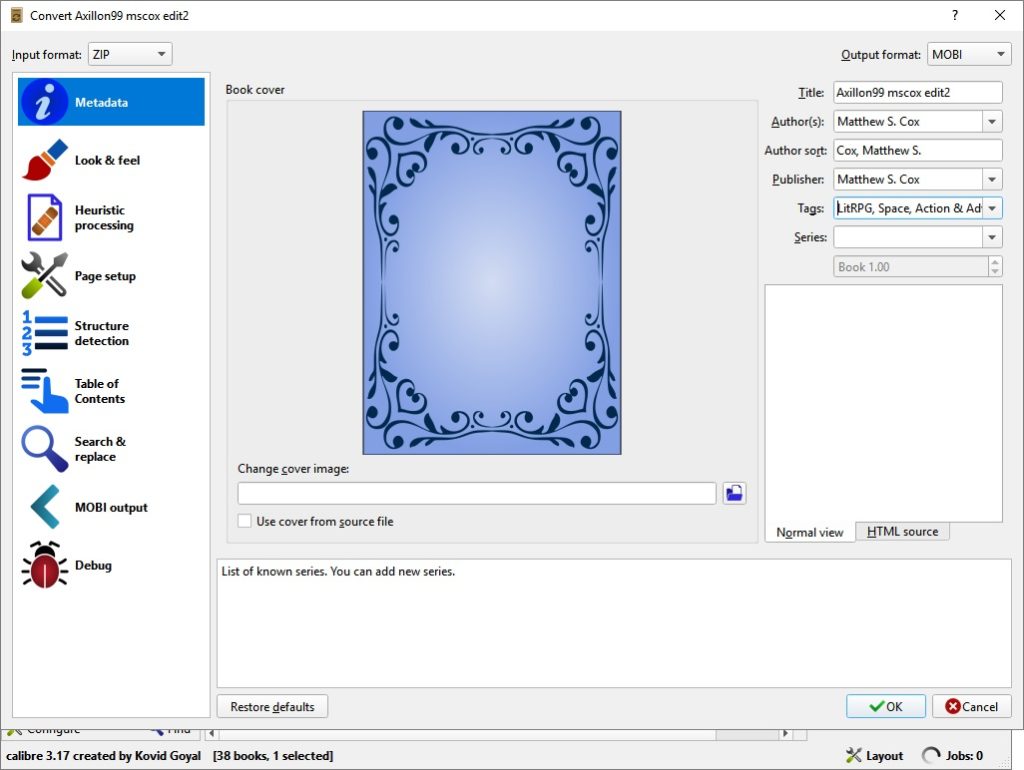
Important: Make sure that you select MOBI as the output format at the top right. Whenever you change this selection, all the fields below it clear out. So if you do this last, you’ll have to re-type everything else. (Ask me how I know this.)
So, after you select MOBI for the output type, fill out the other info: Title, Author name, tags, series title, and book number. Then, click the little blue folder icon in the middle section to add your cover.
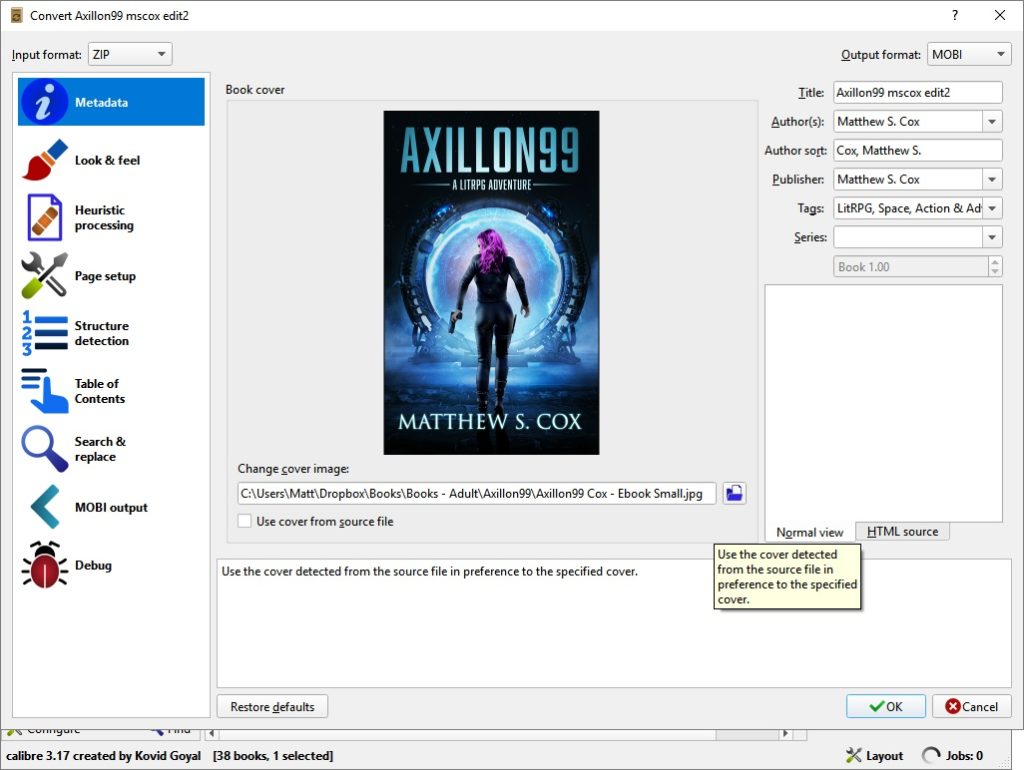
Navigate the file window to the cover image and hit Open, and Calibre should look like this. (Well not exactly like this. You shouldn’t be using someone else’s book cover. But, you get the jist. Your cover art will appear in the middle of the screen instead of grandma’s teacup. And you’re done with this page.
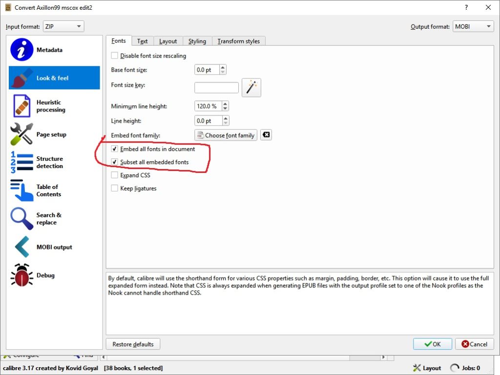
Next, on the “Look & Feel” tab, check these two boxes. Embed all fonts in document will attempt to load the data for the font files you use so that other readers can see them. Depending on the font, this may or may not work and your readers will still get plain text. The subset all embedded fonts is a file size saving measure. Font files can contain hundreds of characters. This option causes Calibre to delete data from the fonts for any glyph (character) that is not used anywhere in the document. Basically, you’re only packing up the stuff you’re going to need.
The text tab has some options (like insert blank lines between paragraphs that some people find help readability). Other people hate the blank line. Fiddle in there at your own discretion, but you don’t need to.
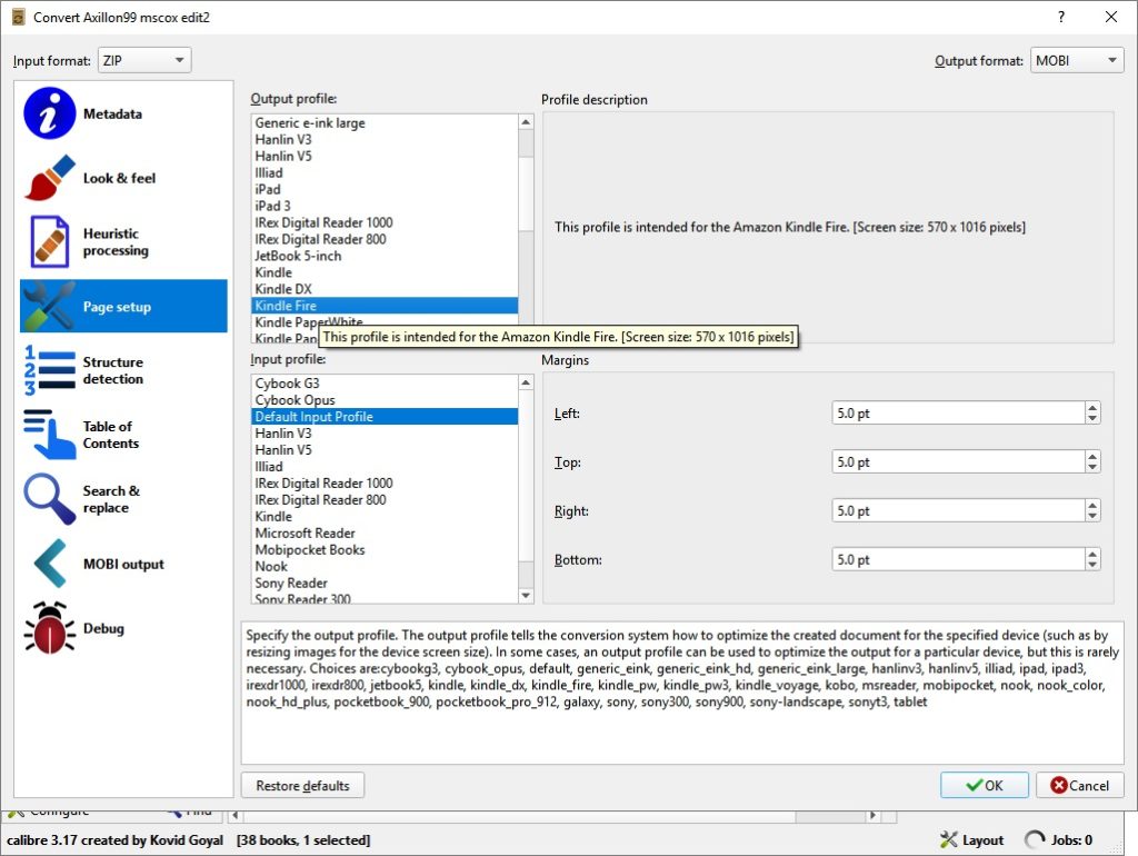
Skip Heuristics unless you’re a programming wizard with copious amounts of LSD on hand. On Page Setup, select the device you’d like to optimize for. (I tend to prefer Kindle Fire as they seem to be pretty popular these days.)
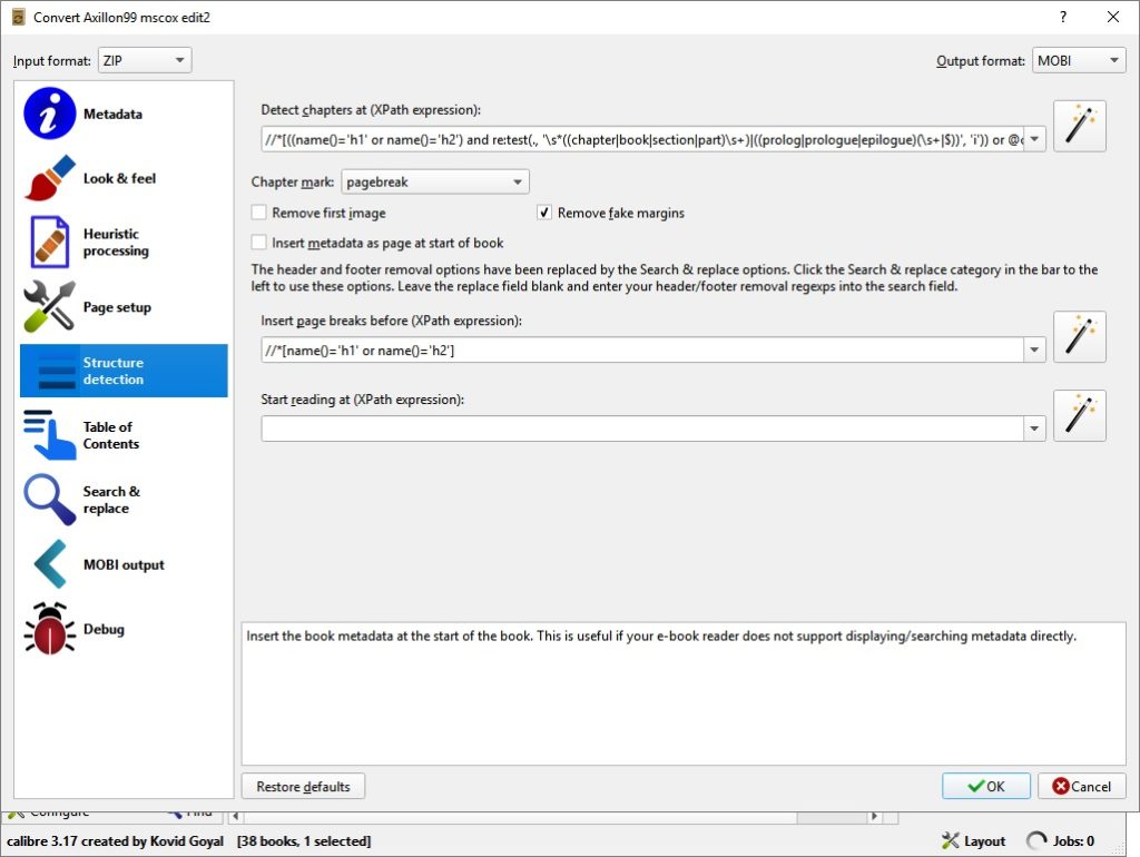
Structure Detection – This is the important part. This is the part that made me tear my hair out and scream invocations to ancient Assyrian demons until I figured out the reason my chapter art floated on separate pages. When you first arrive on this screen, you’ll have an enormous text formula at the top and a not so enormous one in the middle.
Remember the heading 3 thing I mentioned earlier? This is where it comes into play. This page tells Calibre where to create the chapter breaks. By default, it’s looking to do it for heading 1 and 2. Now, if you did NOT use chapter header art and you don’t have the extra blank Heading 3 lines in your word document, you can probably leave this page as is and not change anything except for the middle line.
The “insert page breaks” line does exactly what it says. I have no idea why this is a default option since it results in extra blank pages in the MOBI document after every chapter. People hate having to double swipe to get to the next chapter. Delete this line.
If you DO have chapter art and did the Heading 3 thing, you’ll want to edit these formulas as follows:
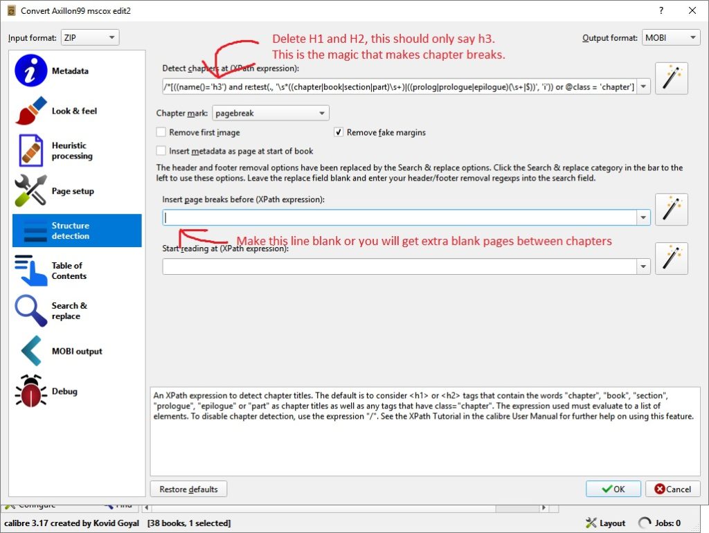
Edit the top line so it has only H3 and not H1 and H2. Clear out the “insert page breaks” line in the middle. Leave it blank. Extra white pages = bad. No one likes a litterbug.
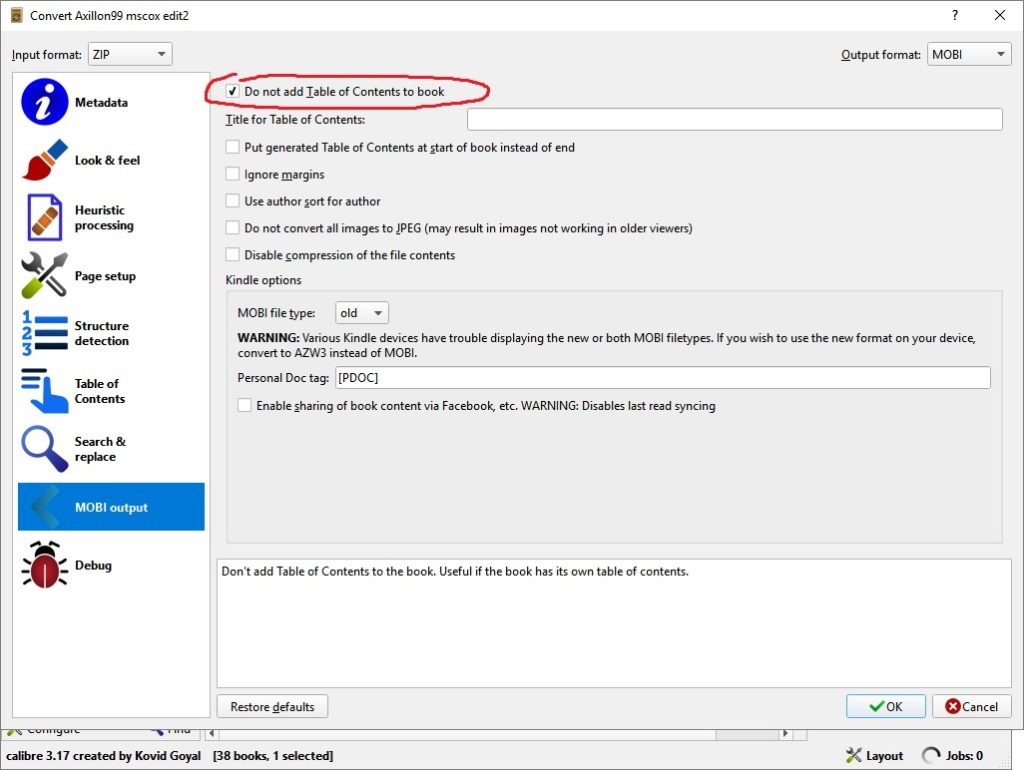
Skip down to the MOBI output tab. You should have added a Table of Contents in Word, so you do not need Calibre to add another one. Check the box for Do not add Table of Contents to book. I get it that a lot of people these days have short attention spans, but no one needs TWO tables of contents in a book.
And that’s that… Click the OK button at the bottom of the screen. The little army of gnomes inside Calibre will start slaving away at their hot forges. Eventually, that little “Jobs” indicator at the bottom right will go back to zero. When that happens, the magic is finished.
Hopefully.
If you’re like me, you’ll know that nothing ever works perfectly the first time. More like conversion #40. So, the true final step is to open the e-book and scroll through the whole thing. Look for weird formatting, stuff out of place, strange justification.
Calibre does a pretty decent job of rendering the e-book but it’s not infallible. If you don’t catch any errors while viewing it through Calibre, you can move on to the next step. If you DO find a problem, delete your Webpage, filtered folder, go back to your e-book version of the Word document and make any changes there. Once you’ve updated the Word document, save it again. Then save it as a Webpage, filtered. Then repeat all the steps in this article all over again. Keep doing this until you can’t find any flaws in the e-book while looking at it in Calibre.
Finally, ten shots of the hard stuff later, when you’re sure the e-book is perfect, go up to the top and click the arrow next to the SAVE button. Select the option “Save only MOBI file in a single directory.”
Point Calibre at wherever you want it to generate the MOBI file.
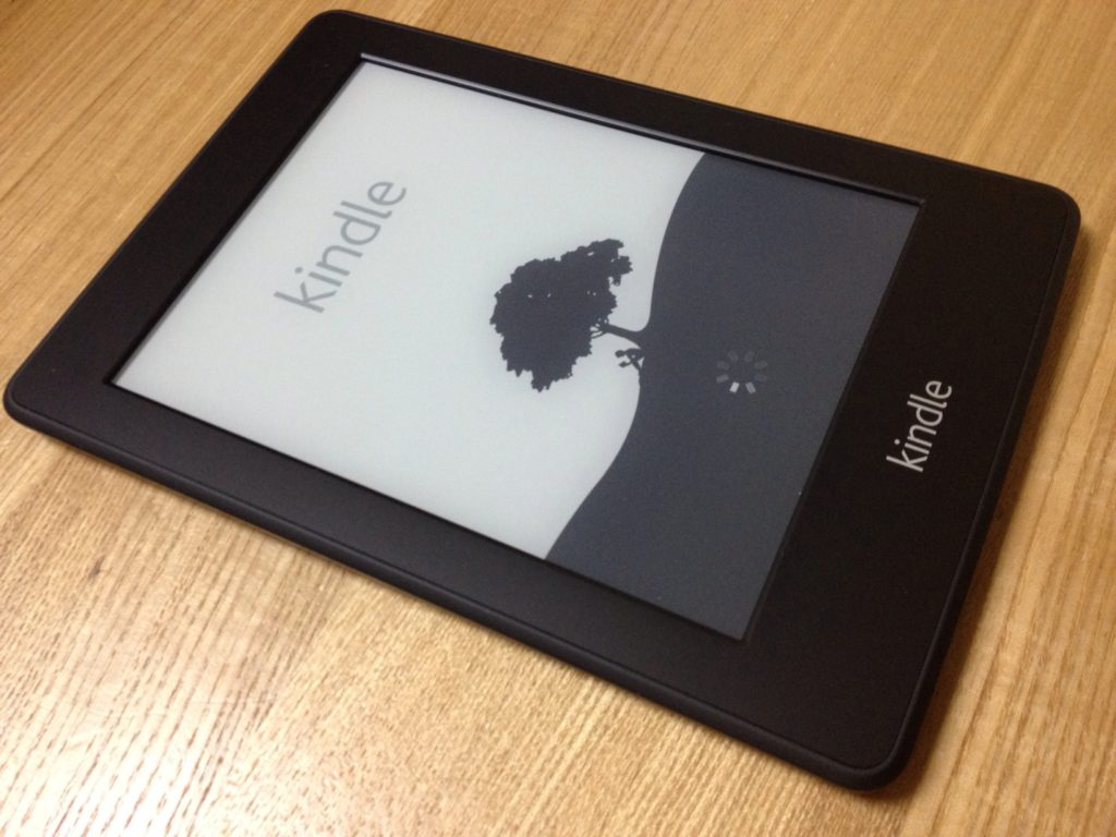
This is the file you’ll upload to KDP. If you have a Kindle (I really hope you do since you’re an author) email the document to yourself at your kindle.com address. Open it on your actual kindle and repeat the checks to make sure everything looks fine. If you find any issues, it’s back to the e-book version of the Word document to fix them, then re-export, then re-convert.
Isn’t this fun 🙂
But it’s worth it.
Happy writing!
-Matt
(Feel free to post questions in the comments)

I’m in the editing stage and not near the end to consider doing this yet. But I’ll keep this article chock-full of information available for when I’m considering this aspect of my project. Thanks for all your effort with this.
You’re welcome!
Great article, Matt. I’m having one problem that you might know how to handle. The mobi file I create with Calibre is changing my chapter heading fonts from Times New Roman to some monospace font (looks like an old typewriter font). I can’t find the fix to this. The last document I created in Calibre was in December of 2017 and this didn’t happen. Checked all my doc settings. Tried latest version of Calibre. Uninstalled lastest version and re-installed earlier version. Nothing works. Do you have any ideas?
Hi Jack. I’ve run into cases where fonts disappear or change in the MOBI version too. As best I’ve been able to find, it’s due to the Kindle’s limited support for fonts. When researching it, I happened across some articles that made the case for abandoning the fanciness for the kindle version as those readers are more there for the story itself, and not so much how it looks. I can think of one workaround, which would be to make your chapter headings into graphics/images using the font you like, and inserting it as a jpg or png into the document before conversion. That way it will look exactly as you intend. Fonts in ebooks are subject to changing based on the reader’s preferences for scaling and whatnot, so it’s an inexact thing to expect a typeface to remain consistent in that medium. Unless, of course, you make it into an image. In that case, they’ll see whatever you want them to see. 🙂
Thanks for the data, Matt. I appreciate the quick response.